
Since its launch last year, the Apple Watch has become an indispensable part of my digital toolkit.
The watch’s benefits are numerous. First and foremost, its arrival led me to being a watch-wearer again after several years absence. At its core, I believe Apple Watch is a good timepiece; that I can use it for other Dick Tracy-esque things like take phone calls and talk to Siri are cool, but mostly ancillary benefits. I enjoy wearing it because I can easily tell time equally as much as I enjoy its role as the satellite that orbits my iPhone. Then there’s the fashion angle—beauty lies in the eye of the beholder, the adage goes, but I admire the watch for its form just as much as I do its functions.
I’ve committed to the device over the last year and a half in large part because of the accessibility gains it affords me. Getting iMessage notifications on my wrist, for example, has saved me so much time and effort. Whereas before I was constantly reaching into my pocket for my phone to answer texts, all I do now is glance at my watch and tap (or speak) a quick response. The accessibility win here is that I spend less visual and physical motor energy in looking at my phone’s screen and composing a reply. Even the act of reaching for my phone can be troublesome, accessibility-wise, since I have weaker muscles in my hands and fingers caused by cerebral palsy. Depending on the situation, getting my phone out of my pocket is an exercise in futility adventure at times.
Other than religiously logging my daily water intake with WaterMinder, I don’t use my Apple Watch much. Even the larger screen of the 42mm model still is too small for me to want to look at for more than a minute. It’s for this reason that I’m thankful for watchOS 3’s user interface enhancements. Aside from the obvious performance gains, watchOS’ conceptual overhaul and design tweaks have made the user experience more visually accessible than ever. From the enhanced Apple Watch app to the splashes of color throughout the system, watchOS 3 has breathed new life into my “Series 0” hardware. It’s been so good that it almost feels like I have a brand-new device.
Color Means Contrast
As is the case with all of Apple’s software, the first two versions of watchOS were highly accessible. The accessibility feature I use most on my Apple Watch is large text, as the device supports Dynamic Type. The watch’s display is relatively small, so I increased text size quite a bit—it’s much larger than I normally use on my iPhone and iPad—and it works great.
The problem with watchOS until now was Apple chose to go with a monochrome color scheme. It looks nice and I had no problem seeing items on screen, but there was room for improvement. But in watchOS 3, there are splashes of color throughout the system. I think it makes the interface even more aesthetically pleasing, but the best part about it is the heightened contrast color gives to the black background and the OS’s various controls.
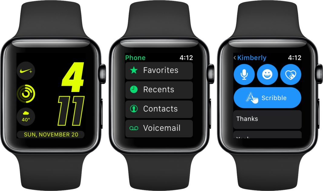
A great example of this is Messages. If I’m talking with someone in iMessage, the options to send a reply (voice, emoji, heartbeat, or scribble) are in blue. (These buttons are green if I’m talking to someone not in iMessage.) Below that are the smart replies, which appear as monochrome buttons. From an accessibility point of view, this juxtaposition of contrast is great for the simple reason that the color gives my eyes something to look for and fix on. I know a subset of the controls on the reply screen are going to be blue, so I needn’t worry about trying to find them. Likewise with the smart replies; all I do is scroll down until I see the monochrome.
This type of effect is seen in other apps in watchOS too, including Maps, Music, and Weather. As for third-party apps, I don’t use many on my watch, but the aforementioned Water Minder uses color just as well. Its app uses blue for buttons for logging water; I have no problem seeing how many ounces I need.
Unheralded Yet Indispensable
For as much as I praise watchOS, a big reason for my enjoyment of my Apple Watch is its companion Apple Watch app. It’s so instrumental that I consider it a de-facto accessibility feature in many ways. The watch’s screen is too small for even someone with perfect vision to comfortably do a lot, so it’s not hard to imagine what it’s like for a person who’s visually impaired. In this sense, the Watch app is a godsend.
The fact that the bulk of the “administrative duties” (setting preferences, watch faces, etc) are offloaded to the Apple Watch app accomplishes two things. First, it obviously minimizes the time spent staring at the watch’s tiny display. As I stated earlier, I want to interact with my watch as little as possible to save energy. Secondly, it allows users, especially those with fine-motor delays, to manipulate their watch without touching the screen or turning the Digital Crown all the time. It’s an indirect route, but in an accessibility context, the app is a sanctuary for a person who, like me, has visual and/or physical motor disabilities.
The watch’s cramped space makes it difficult for anyone to use it extensively, but it can be even more confining for someone with a disability. That’s why the Watch app is such a essential part of the experience—especially on the Plus-sized iPhones, the app shines. Doing things on the larger canvas saves a lot of time and precious energy. To me, that’s a huge accessibility win.
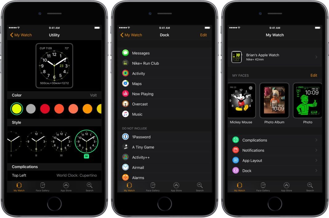
The Apple Watch app in watchOS 3 improves general accessibility in two ways: The Faces Gallery and managing the Dock.
watchOS still has the functionality where you force-press on your watch face and swipe through to change faces. Also still present is the ability to use the Digital Crown to change Complications with very low contrast, black-on-green selectors. I can do the force-press-and-swipe to change faces, but there is no way I am using the Crown to set Complications. In my experience, it’s an accessibility nightmare and I dislike it.
The new Faces Gallery saves me from this drudgery. If I want to set up a new watch face with custom colors and complications, I can do so right from within the app. I can easily pick a color and Complications on my iPhone’s large screen, then tap a button to set it as my default face. Again, as someone with low vision, fighting with small items on a small screen isn’t ideal. That I can configure my faces “remotely” makes the process much more accessible. I love it every time I do it.
The same applies to managing the Dock. I can deal with removing something from the Dock from my wrist, but am so glad I can determine what I see there from the Watch app. It’s terrific.
One side note on the Watch app’s design. I love its white-on-black color scheme. The high contrast makes it super easy to spot icons and read text because both elements jump off the screen. I sometimes wonder if the Watch app is a prelude to iOS getting a system-wide dark mode. I’d love one and would likely use it full-time if and when Apple ever ships it. I use dark mode exclusively in several apps across iOS and macOS, including Safari (for Reader View), Overcast, and Ulysses. It isn’t that I can’t use a normal black-on-white interface; it’s just I greatly prefer the contrast gains I get when I use dark mode. Besides, I think they look cool too, particularly Overcast’s.
My Outlook is Bullish
I’m on record as saying that if the Apple Watch’s appeal hinged solely on performance and apps, then I likely would’ve thrown it into a drawer long ago. But that’s not why I appreciate it. I regularly wear a good-looking watch and the accessibility gains I get from it outweigh any annoyances over performance lag. watchOS 3’s growth has renewed my enthusiasm for the platform.
Simply put: I wouldn’t want to be without my Apple Watch. I’m a fan and am excited for its future.

Leave a Reply