
I’ve written before about my affinity for streaming music.
After years of spending lots of money on music in record stores and on iTunes, the “all you can eat” model of streaming music holds great appeal to me. I pay a flat monthly fee in exchange for all the music my ears can handle. That’s a good deal. I don’t have to worry about managing my old iTunes library anymore, nor do I need agonize over what to sync. Any song or album my heart desires is now on-demand, just a few taps away.
My first foray into the world of streaming music services was with Rdio. I chose it over Spotify because I appreciated its beautiful user interface and its focus on albums. Then it went away last year, and I quickly boarded the Apple Music train. I’ve long appreciated the vastness of the iTunes catalog—by contrast, Rdio lacked favorites that I couldn’t stream—so Apple Music was best of both worlds. I had unfettered access to the entirety of iTunes and I could stream anything, anytime.
I’ve been using Apple Music since the trial rolled out in June 2015. I remain happy with it, unlike many of the tech commentariat. Despite my enthusiasm, however, I have encountered problems. As I reported last February, the initial version of Apple Music was mired by a confusing design and, more importantly, less than stellar accessibility. These issues weren’t severe enough to drive me away from the product, but they certainly put a damper on an otherwise solid experience.
Then came good news. With the advent of iOS 10 came an all-new, totally redesigned Apple Music that addressed both of my biggest gripes about 1.0. Streaming and downloaded music are now clearly marked, but the big win for me is the app is much more visually accessible. It’s for this reason I enjoy using the app more, and it’s one of the biggest highlights of iOS 10 for me.
Big and Bold, Indeed
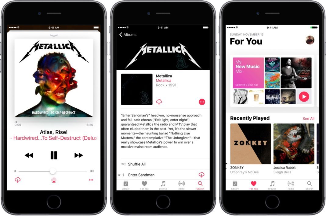
Apple’s slogan for iOS 10 was, at one point over the summer, “big, bold, beautiful.” In the context of Apple Music, there’s an argument to be made that it’s less beautiful than before (see: the Now Playing screen losing its blur), but I think “big” and “bold” are perfectly apt adjectives for the redesign.
From an accessibility perspective, it’s the bigness and boldness that make Apple Music shine in iOS 10. First and foremost, the Dynamic Type is pervasive throughout the app. Headers are ginormous. Whereas previously I had trouble reading Editors’ Notes and track listings, I now can read them fine. The larger text is boosted by the higher contrast, as areas such as the Now Playing screen eschew form for function. It may not look pretty, but the plain background of the Now Playing screen coupled with the large type makes text jump off the screen. This lessens eye strain and fatigue, which happens fast, because I don’t struggle to find things.
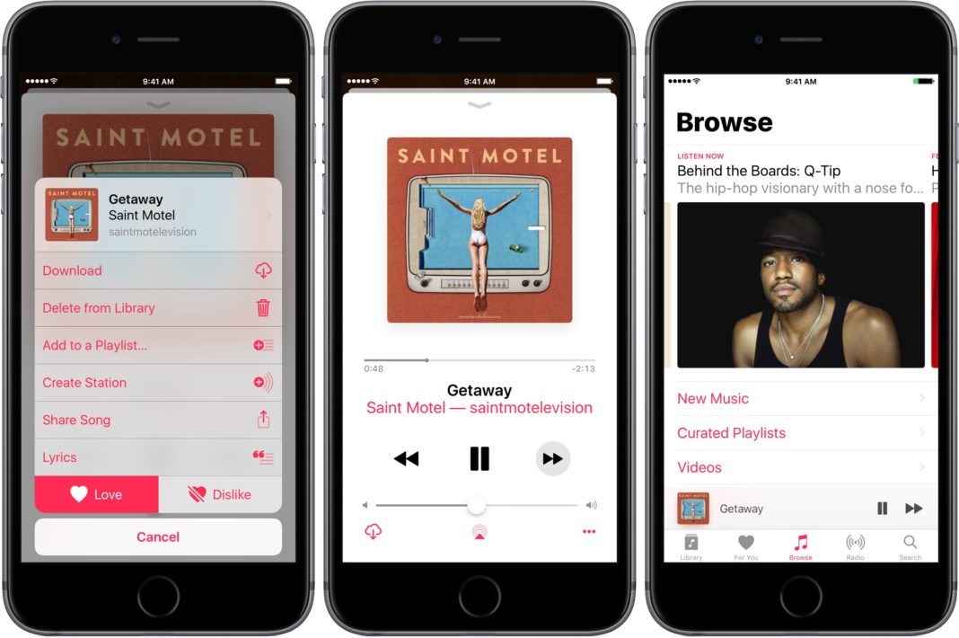
Iconography is better too. My other visual complaint about Apple Music in iOS 9 was that the small text problem was exacerbated by small icons. It was difficult to find the button to, say, share a song or album because it was so tiny. Apple remedied this in the new version: as is the case elsewhere in the system, buttons are more pronounced, more “button-y” than before. It’s a visual style that hearkens back to iOS 6 but with modern sensibilities. I love this change overall, but it’s been especially helpful in the Music app. Again, the better I can quickly scan the screen, the less my eyes have to work.
Put together, the increase in size of text and icons have unquestionably made the biggest difference in my experience with Apple Music. The fact that I can see everything so readily (one exception: the time scrubber is still a tad small) is important because the more I can see, the more I enjoy the app. Eye strain and fatigue are unavoidable facts of life for me, so anything software can do to minimize those things is welcome relief.
Living the Stream
Besides the appearance of Apple Music’s UI, the other problem with it prior to iOS 10 was its jumbled mess of an interface. The most notable issue here was the lack of demarcation between streaming music and purchased music. This cloudiness can be puzzling to anyone, but even more so for people with vision impairments. The crux of the issue is similar to the small text and icons: the confusion makes it harder to find things, which can literally be painful in terms of eye fatigue and strain. This is no small matter; these seemingly-frivolous details have tremendous impact in the aggregate. And it isn’t only vision—people with certain motor impairments may tire of having to tap and swipe their way through the UI in order to find their music.
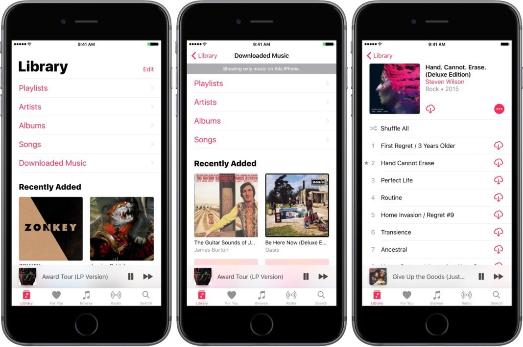
As I wrote in my first story, there was no clear indicator in the previous version of the Music app that this over here is streaming content and that over there is the content you’ve bought. In iOS 10, though, Apple has added such a marker. There’s now a Downloaded Music option at the top of the Library screen. Tap it and you’re presented with all the music currently on your device. Apple assumes you want to stream, but now there’s a one-stop shop to see the music that’s sitting on your device. (And if you want to download music to your device, there’s a button for that for virtually every song or album.)
Why does this matter for accessibility? To reiterate an earlier statement, it matters because the time I spent scouring the old Music app for my stuff was unnecessarily expelling precious energy from my vision. Again, this seems trivial, but these moments have real potential to make or break experiences. I say this all the time in my writing, but it’s really true. What’s more, if you’re someone with a cognitive delay of some kind, Music’s redesign may very well lessen cognitive load. It can make a difference in terms of navigating the user interface.
Bottom Line
Apple Music has flaws, yes. But it’s gotten a lot better since its launch last year, and the iOS 10 refresh makes it more visually accessible than ever. For these things, I’m grateful.
I said at the outset of this piece that I’m a happy subscriber. I like the service a lot, and I see no reason to look elsewhere for my music. It’s imperfect, but as I wrote back in February, it works for me and I’ll continue using it. Your needs and tolerances may vary, but I say Apple Music is $10 well spent.
