
I admit that I still miss much of iOS 6’s design. Many of its design choices were better accessibility-wise than the newer iterations that took their place in iOS 7.
Despite the nostalgia, after two years with the new look, I’ve acclimated to iOS’ re-design quite well. Still, there are things about the iOS user interface in its current form that need attention from an accessibility standpoint — such as buttons and icons.
As someone who’s visually impaired — my condition makes me hypersensitive to design choices — I feel I’m pretty attuned to what works and what doesn’t. So here are four tips I think will greatly help any developer better optimize their apps for visual accessibility.
Use Large Dynamic Type whenever possible
That Dynamic Type is first on this list is hardly a coincidence, as I’ve sung its praises many times before. It’s by far one of my favorite features of iOS.
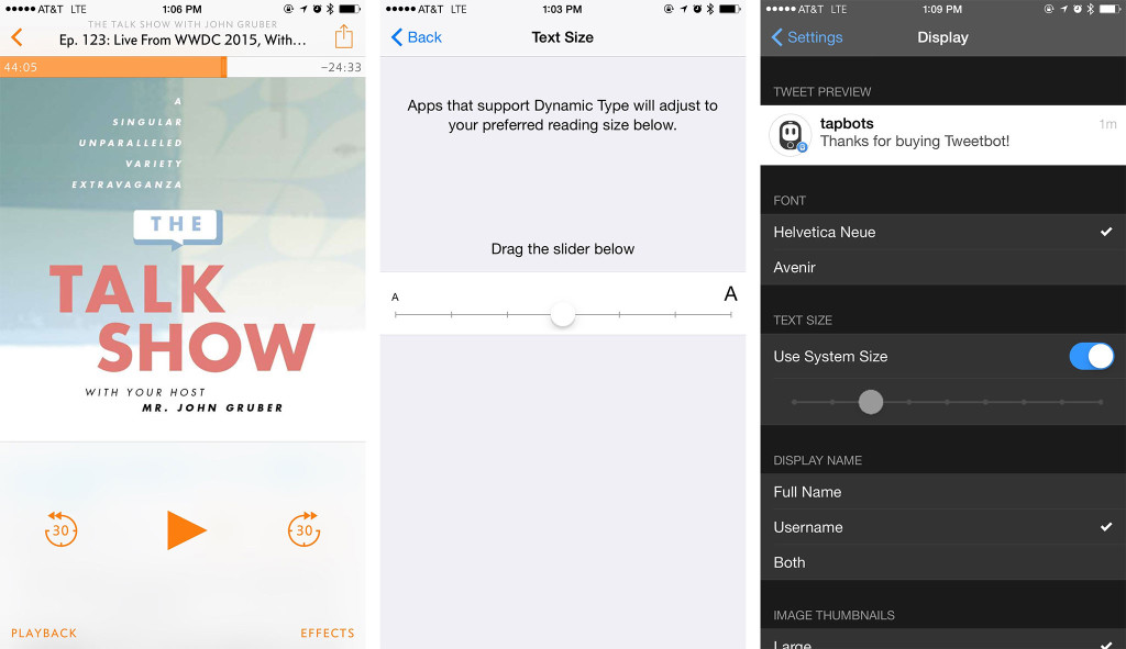
What Dynamic Type does is set the text size system-wide, so that users needn’t have to adjust text size in every app. Mail and Messages, among other built-in apps, support Dynamic Type. And there’s even a developer API so that third-party apps can also integrate with it.
Dynamic Type is a convenient feature, but also one of comfort because I know that wherever I set the slider, apps that support it will use it. Overcast and Tweetbot, as shown above, are two great examples.
Avoid using yellow for anything

In terms of contrast, yellow is a bad color on an OS with as much white space as iOS 8. Apple’s Notes app is a prime example. All its controls use yellow, and it’s extremely hard to read. This is true even with Darken Colors turned on in the Accessibility settings. For as enhanced as Notes in iOS 9 is, I likely won’t use it, despite all the new functionality because of that wretched yellow UI.
Above, you can see the Notes app on the left with yellow action buttons. On the right is Evernote, which allows users to change between light and dark themes within the app.
So, if you like contrast and don’t hate your users, skip on yellow.
Make your buttons/icons as big as possible
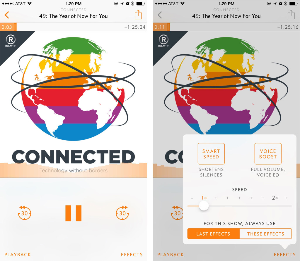
One of my favorite and most-used iOS apps is Marco Arment’s podcast player, Overcast. And my absolute favorite thing about Overcast is the ginormous buttons on the Now Playing screen.
With buttons as big as these, it makes them easy to see and tap, which is an accessibility win on multiple levels, because not only are big buttons easy to see, but they also provide bigger touch targets for users who have motor delays. It’s two benefits in one.
Use gestures judiciously

While apps like Clear are renowned for eschewing buttons for a gesture-driven interface, I find Clear (and apps like it) to be confusing. This is because there is a lack of visual cues that alert me to what I can and can’t do. Clear is well done and aesthetically appealing, but I think it’d be better with at least a few buttons to augment gestures. A good example of this is Mail’s swipe-left-and-get-action-buttons system. I swipe and I get a visual representation of what I’m able to do.
In terms of accessibility, take into consideration that an app that’s completely driven by gestures might not be the best model for users with cognitive delays, such as many children with autism. An edge case, to be sure, but the abstract nature of gestures can potentially be hard to comprehend for the cognitively impaired. (Even for me, the gestures can be hard to remember at times!) Thus, it may be easier for some people to have more concrete cues — buttons and/or text — to supplement the gestures. It gives the user a complete picture of the task at hand.
In writing this article, I was reminded of how I wish Apple would go back to “classic” iOS 6 and find ways to apply some of its visual design to what we have today. I have this utopian vision of the best of iOS 6 mashed with the best of iOS 8 in order to create the nicest, most modern-looking software while still being functional to the visually impaired.
If you’re a developer, I’d love for you to share some feedback. What have been your struggles when designing for visual accessibility? Do you have helpful tips for other developers that I didn’t mention? Let me know in the comments!

Leave a Reply